Philip M. Orton, Stevens Institute of Technology and Stefan Talke, California Polytechnic State University
Centuries ago, estuaries around the world were teeming with birds and turbulent with schools of fish, their marshlands and endless tracts of channels melting into the gray-blue horizon.
Fast-forward to today, and in estuaries such as New York Harbor, San Francisco Bay and Miami’s Biscayne Bay – areas where rivers meet the sea – 80% to 90% of this habitat has been built over.
The result has been the environmental collapse of estuary habitats and the loss of buffer zones that helped protect cities from storm surge and sea-level rise. But the damage isn’t just what’s visible on land.
Below the surface of many of the remaining waterways, another form of urbanization has been slowly increasing the vulnerability of coastlines to extreme storms and sea-level rise: Vast dredging and engineering projects have more than doubled the depths of shipping channels since the 19th century.
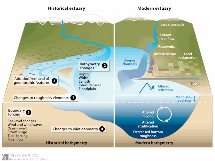
Some of these oceanic highways enable huge container ships, with drafts of 50 feet below the waterline and lengths of nearly a quarter mile, to glide into formerly shallow areas. An example is New Jersey’s Newark Bay, which was as little as 10 feet (3 meters) deep in the 1840s but is 50 feet (15 meters) deep today.
A consequence of dredging deep channels is that water also enters and exits the estuaries more easily with each tide or storm. In these dredged channels, the natural resistance to flow created by a rough and shallow channel bottom is reduced. With less friction, that can lead to larger high tides and storm surge.
As coastal engineers and oceanographers, we study coastal ocean physics and storm surge. There are solutions to the problems “estuary urbanization” is causing, if people are willing to accept some trade-offs.
An unintended side effect of dredging
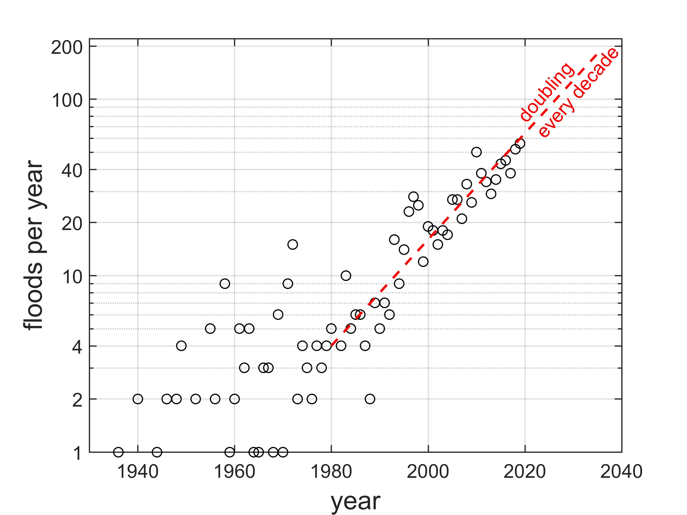
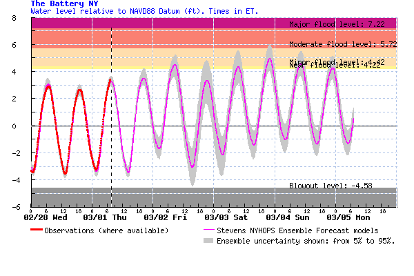
The effects of dredging are most visible in the daily tides, which have grown larger over the past century in many estuaries and aggravated nuisance flooding in many cities, as our research shows.
Tide range – the average variation between high and low tide – has doubled in multiple estuaries and changed significantly in others. As a result, high-tide levels are often rising faster than sea-level rise, worsening its consequences.
The most common culprit for these larger tides is estuary urbanization.
For example, in Miami, where the tide range has almost doubled, a major contributor is the construction and dredging of a nearly 50-foot-deep (15 meter), 500-foot-wide (150 meter) harbor entrance channel beginning in the early 20th century.
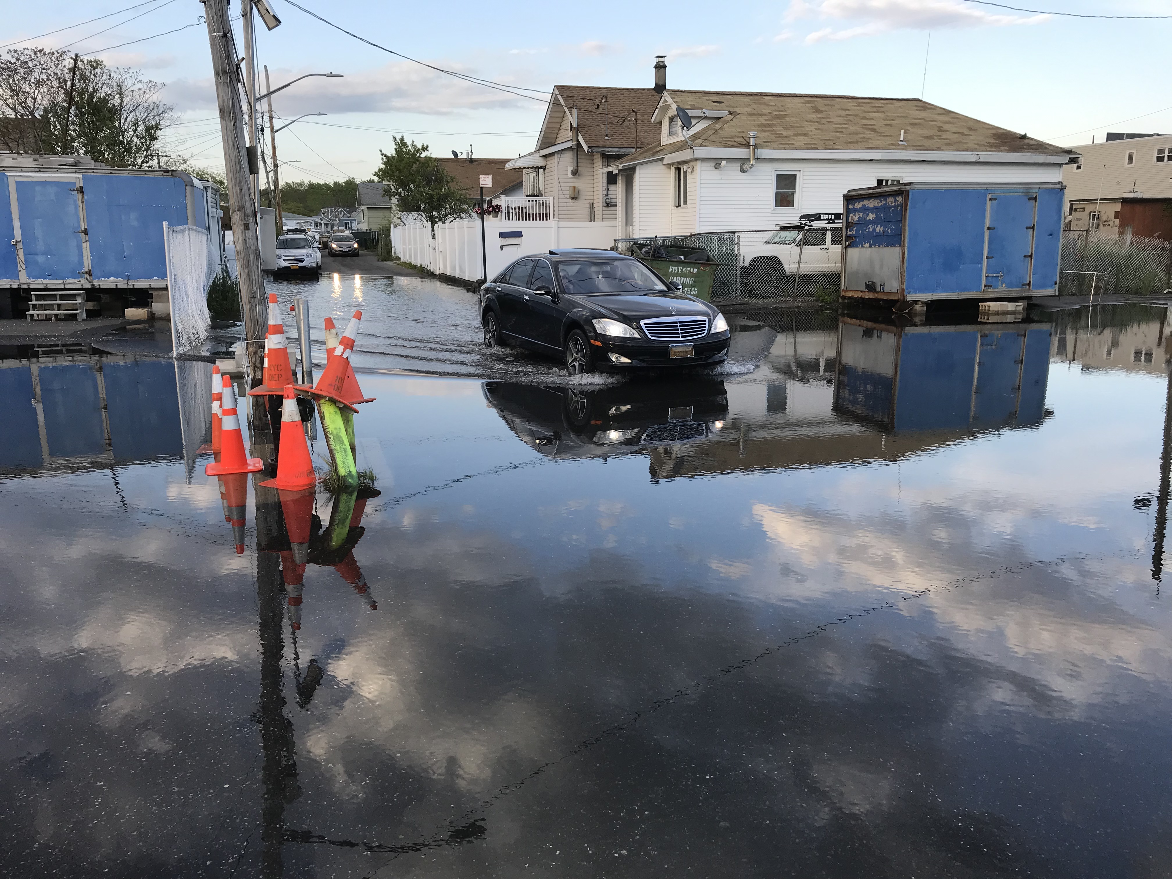
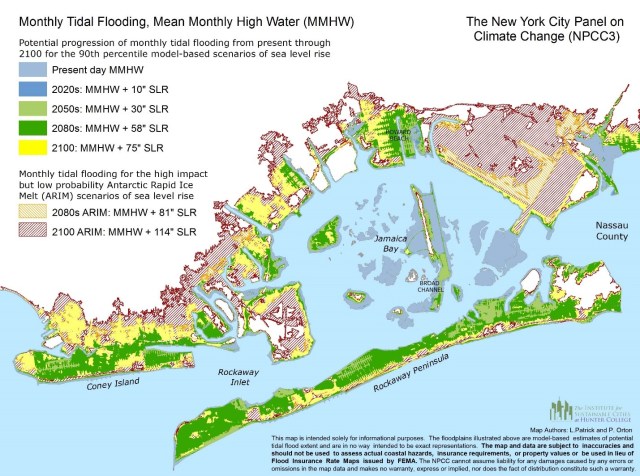
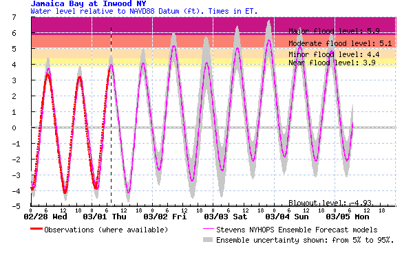
In New York City, some neighborhoods in southern Queens see 15 minor tidal floods per year today. Computer modeling shows that these floods are caused in about equal measure by sea-level rise and landscape alterations, including dredging and wetland reclamation projects that fill in wetlands to build industrial sites, airports and neighborhoods.
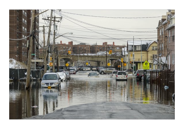
Evidence and computer modeling show that any hurricane storm surge affecting parts of New York City, Jacksonville, Wilmington, Philadelphia, Southeast Florida and Southwest Louisiana, among other locations, will likely produce higher water levels due to estuary urbanization, potentially causing more damage in unprotected regions.
These costs have gone largely unnoticed, since changes have occurred gradually over the past 150 years. But as sea-level rise and turbo-charged storms increase flooding frequency and severity, the problem is becoming more visible.
Building solutions to the flooding problem
In response to rising sea levels, a different form of estuary urbanization is attracting new attention as a possible solution.
Gated storm-surge barriers or tide gates are being built across estuaries or their inlets so they can be closed off during storm-surge events. Some examples include barriers for New Orleans; London; Venice, Italy; and the Netherlands. Such barriers are increasingly being proposed alongside levee systems for coastal protection of urbanized estuary shorelines.
The U.S. Army Corps of Engineers recently recommended surge barriers for 11 additional estuaries, including near Miami, Jamaica Bay in Queens and Galveston, Texas.
Surge barriers are not long-term solutions to flooding driven by sea-level rise, and their negative impacts remain poorly understood. https://www.youtube.com/embed/MFrZLbjlrRY?wmode=transparent&start=0 Venice’s rising flood wall includes 58 gates, each about the size of two tennis courts, that rise to block the inlet from storm surge.
Natural solutions
Wetlands and mangroves have also emerged as a popular nature-based solution.
Communities and government funding have focused on attempts to restore or create new wetlands as buffers in shoreline areas. But this solution is ineffective for flood protection in most harbor cities, such as New York, due to the lack of available space.
A storm surge crossing over a mile of marsh can be reduced by several inches, depending on the site’s characteristics. But typical urban estuary waterfronts have only tens of feet of open space to work with, if that much. In a narrow space, the best that vegetation can do is reduce wave action, which often isn’t the the most pressing problem for cities on estuaries that are typically sheltered from wind-driven storm waves.
As a result, engineered wetlands, while attractive, may be ineffective, especially if trends in ship sizes and estuarine urbanization continues.
Better ways to put nature back to work
Our research reveals an opportunity for scientists, engineers and broader society to think bigger – to consider a more comprehensive reshaping and restoration of the natural features of estuaries that once mitigated or absorbed flooding.
Possible solutions include halting the maintenance dredging of underutilized shipping channels, gradually retreating from vulnerable – and now often waterlogged – landfill industrial sites and neighborhoods, and restoring these larger expanses to wetlands.
These approaches can sharply reduce flooding and provide years of protection against sea-level rise. Restoration to historical channel and wetland configurations, however, is rarely given serious consideration in coastal storm risk management studies because of the perceived economic cost, but also because the cumulative effect of deeper channel depths is often unrecognized.
Renaturing urbanized estuaries in these ways could be paired with buyout programs to also reclaim the floodplain, reducing risk in more sustainable ways. Or it could be paired with seawalls to protect existing neighborhoods in a more ecologically beneficial way. These approaches should be considered as alternatives to further urbanizing our cities’ few remaining natural areas – their estuaries.
Philip M. Orton, Research Associate Professor in Ocean Engineering, Stevens Institute of Technology and Stefan Talke, Professor of Water Resources, California Polytechnic State University
This article is republished from The Conversation under a Creative Commons license. Read the original article.